NightNight
- BITESIZE UX: CHALLENGE
- Programs Used: Grid paper, Sketch
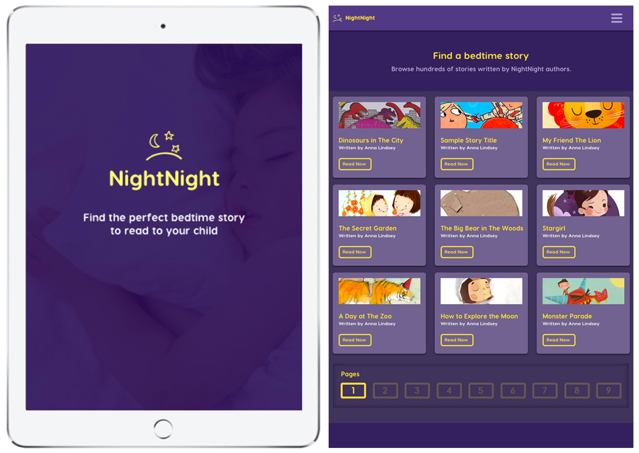
NightNight - An iPad app where authors publish short stories that parents can read to their children before bed.
Problem
Help parents find the perfect bedtime story to read to their children, NightNight wants to make it easier for their users to quickly find the perfect bedtime story.
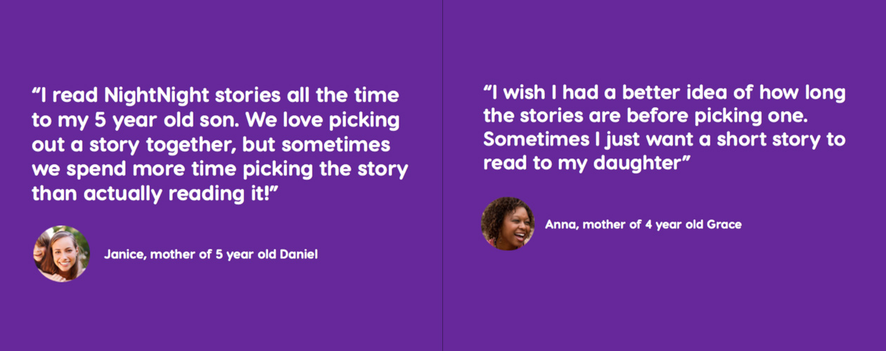
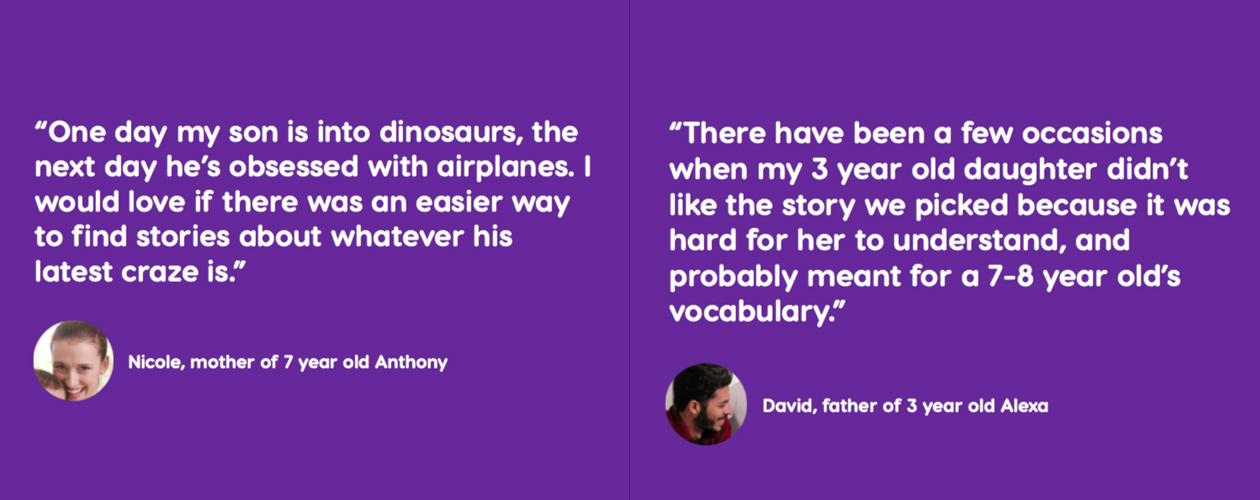
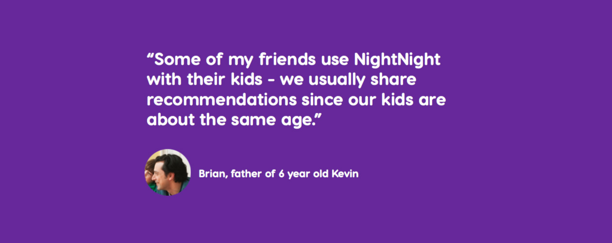
NightNight provides the following feedback from users on their current experience.
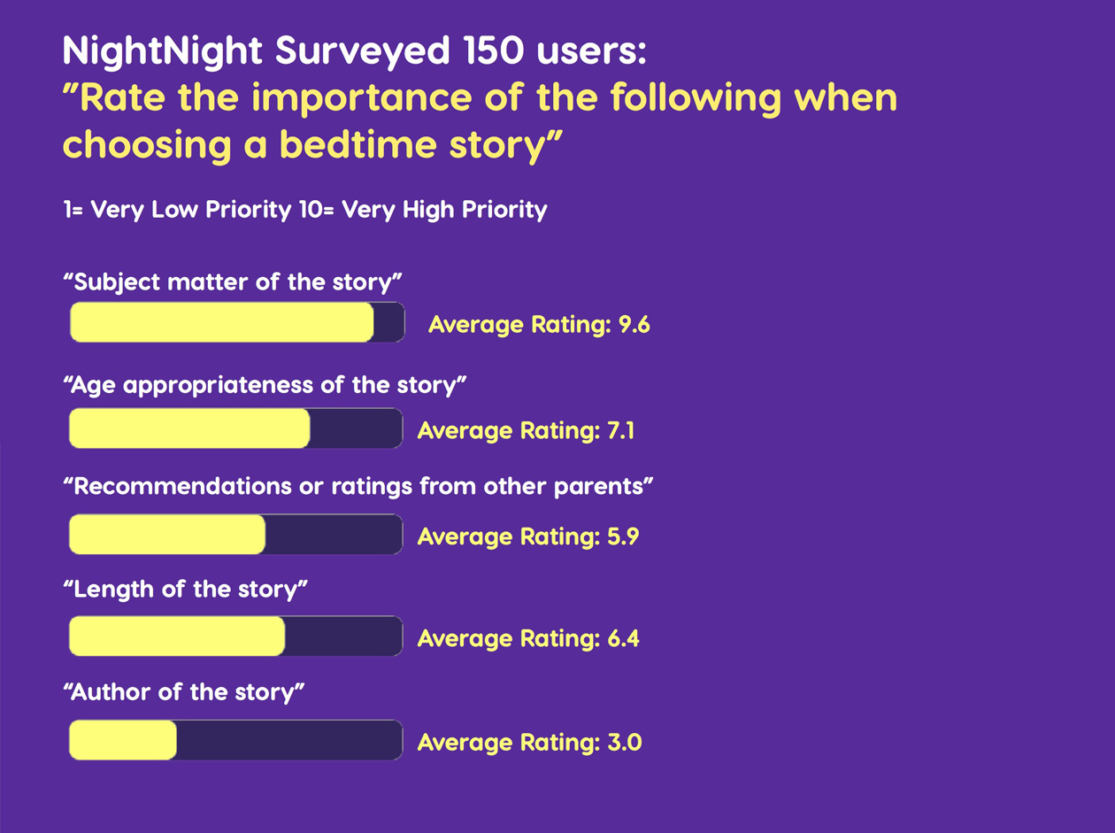
NightNight surveyed 150 users: What's the importance in choosing a bedtime story.
Research
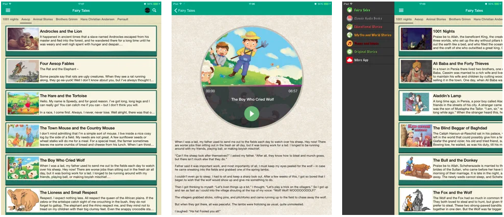
Researched other bedtime story apps on an iPad for competitive analysis.
01Me Books
By Me Books - Apple Store
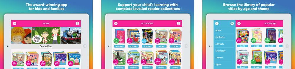
02MyWonderBooks - Kids Audio Story Books
By NMZone - Apple Store
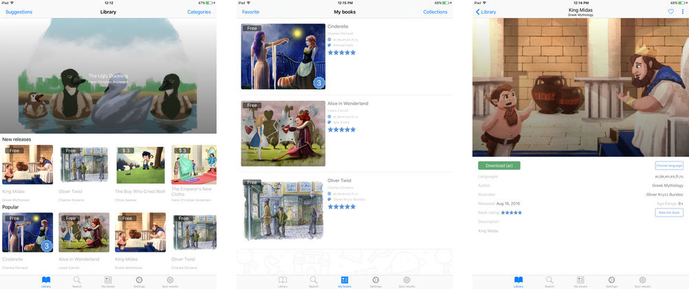
03Audio bedtime Stories For Kids
By duc le - Apple Store
Process
Thinking of how kids would visually look at images and parents need to view information, a card layout came to mind. A card is a small rectangular module with imagery and text, it's an entry point for users to learn more details, balance the aesthetics, and the usability of the interface. Card UI design is a default choice because cards are easy to use, and they can also display content that contains different elements.
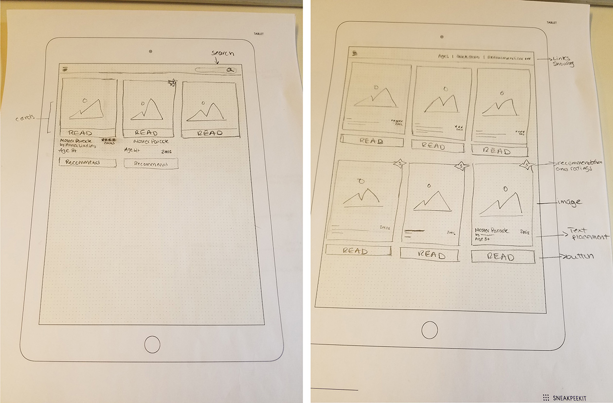
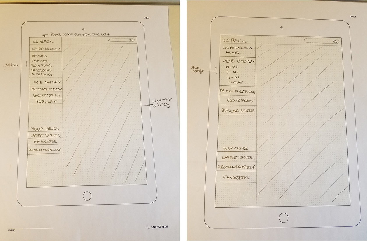
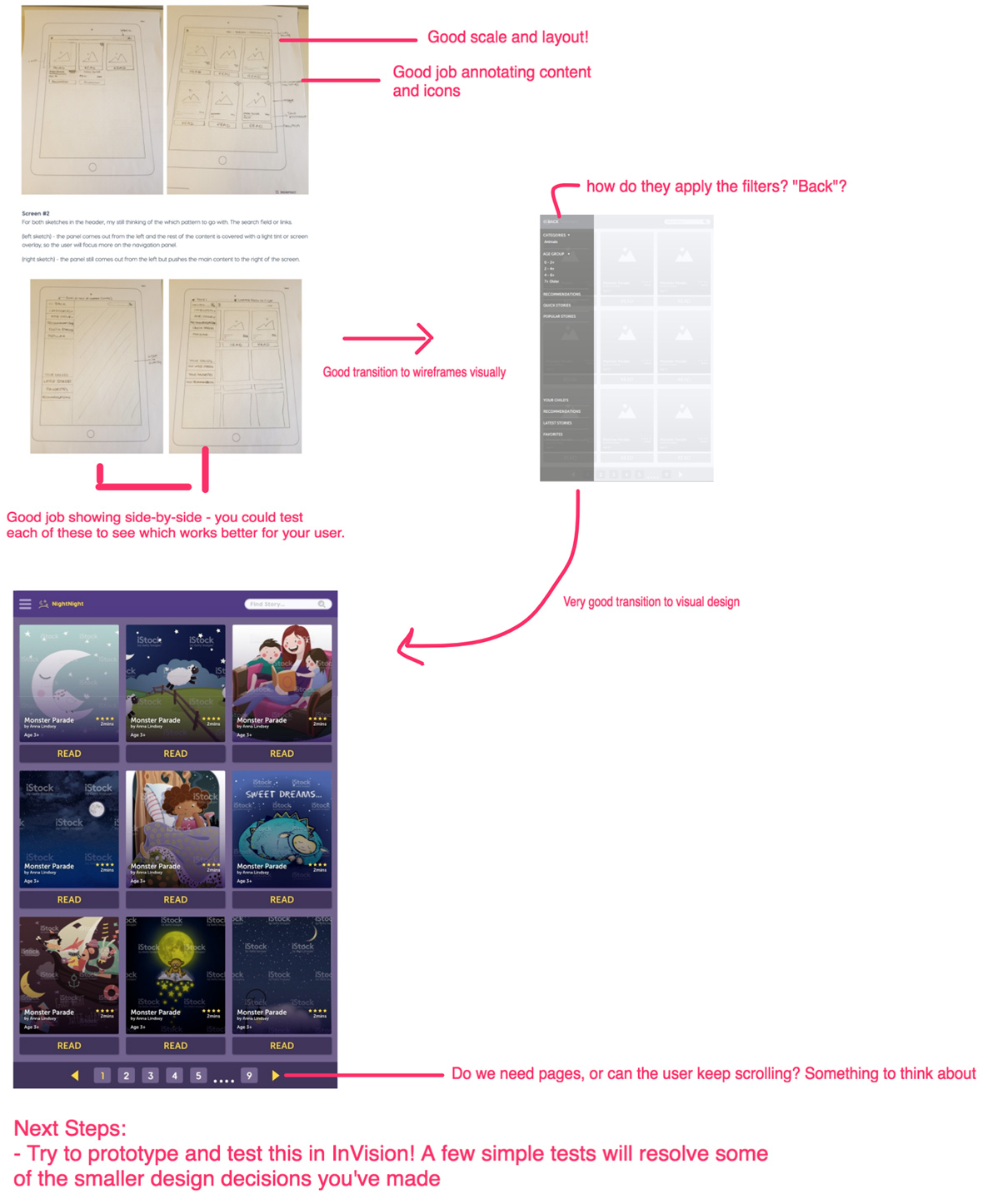
(left sketch) - the panel comes out from the left and the rest of the content is covered with a light tint or screen overlay, so the user will focus more on the navigation panel.
(right sketch) - the panel still comes out from the left but pushes the main content to the right of the screen.
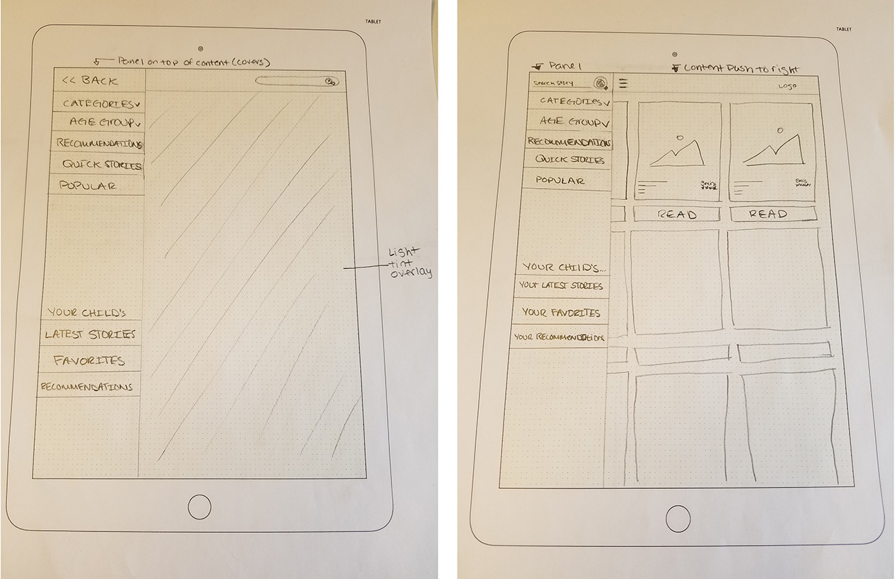
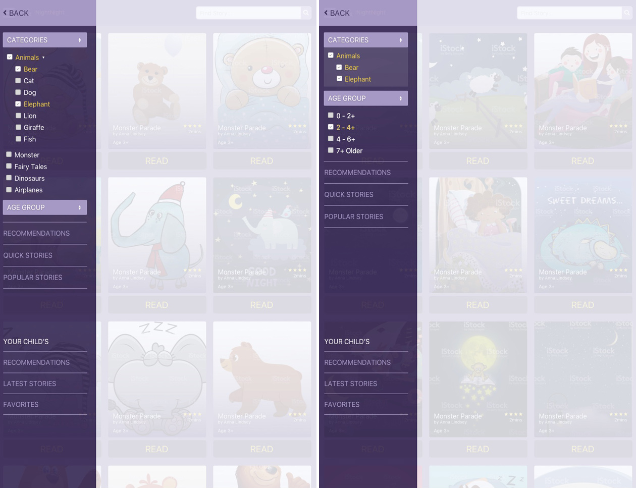
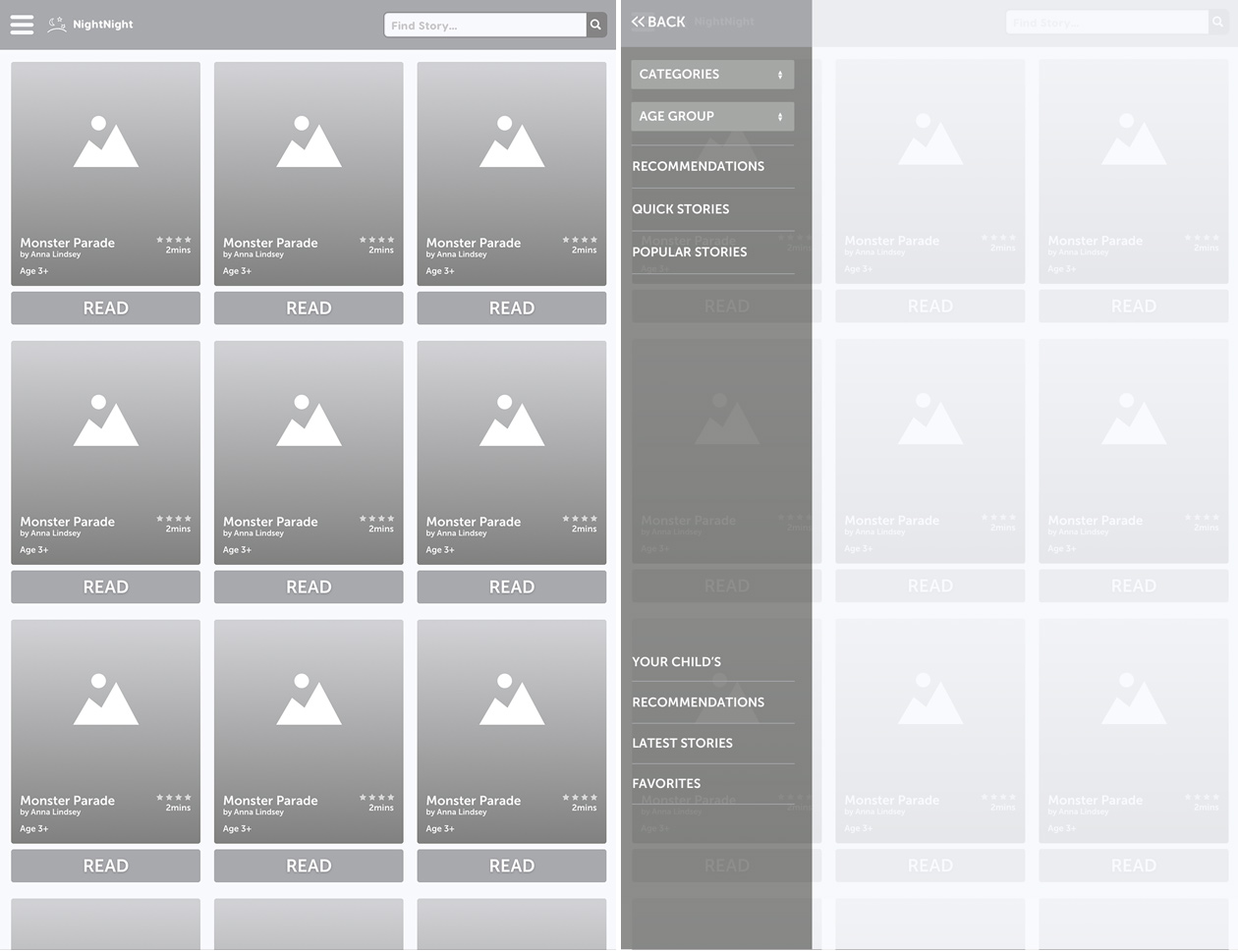
Panel display options.
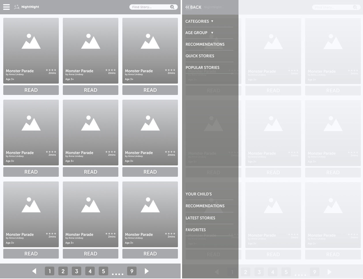
Wireframes
Once I had my concepts tight, I started straight with low-fidelity wireframes to continue to display each idea and then continued to high-fidelity mock-ups.
Feedback
After submitting my deliverables to the UX challenge, I received a positive amount of feedback to continue to keep moving forward.
Changes & Updates
Based on the feedback gathered, I ideate my wireframes to reflect.
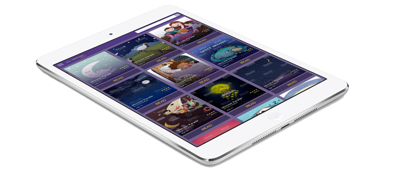
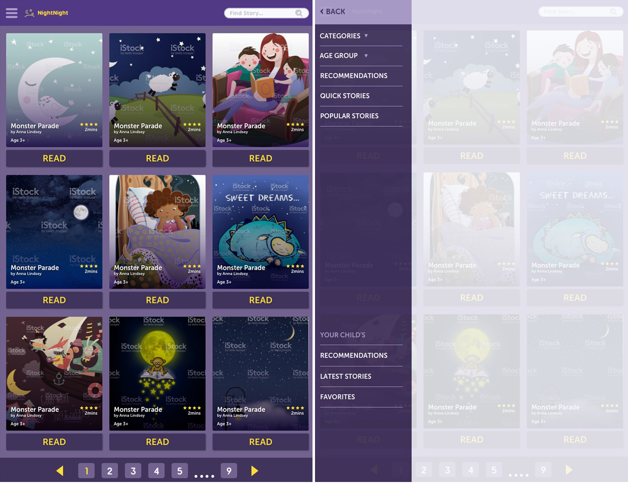
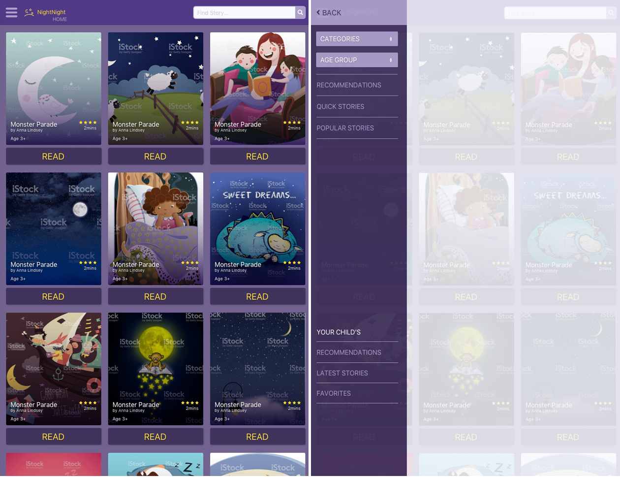
Home screen (left) - the header, I extended the search field for more breathing space and removed the pagination because I think it will be easier for the user to scroll than waiting on the next page to load.
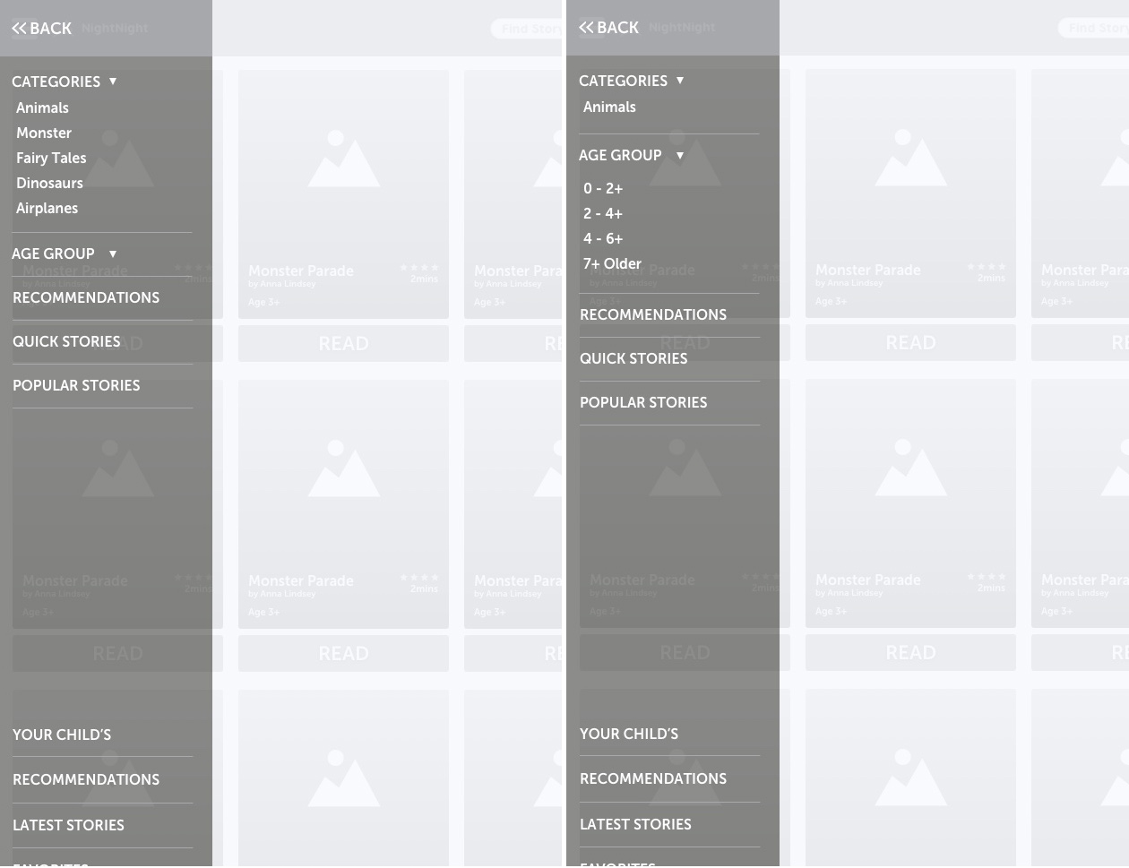
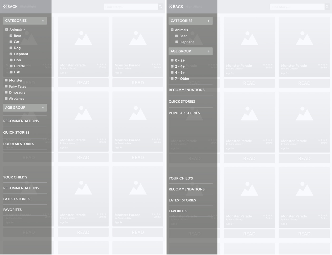
Panel screen (right) - I made the following changes to the panel navigation after understanding more conventions on filters, sorting, and the processes of narrow down results.
View of filter options.
Home & panel screens
Filter option screens