404 Erorr Page
- BITESIZE UX: CHALLENGE
- Programs Used: Grid paper, Sketch
- View: Erorr Page
Problem
Redesign UXHires.com 404 Error Page for desktop & mobile. They are looking to improve a potentially frustrating experience when a user tries to access an incorrect or broken link.
Research
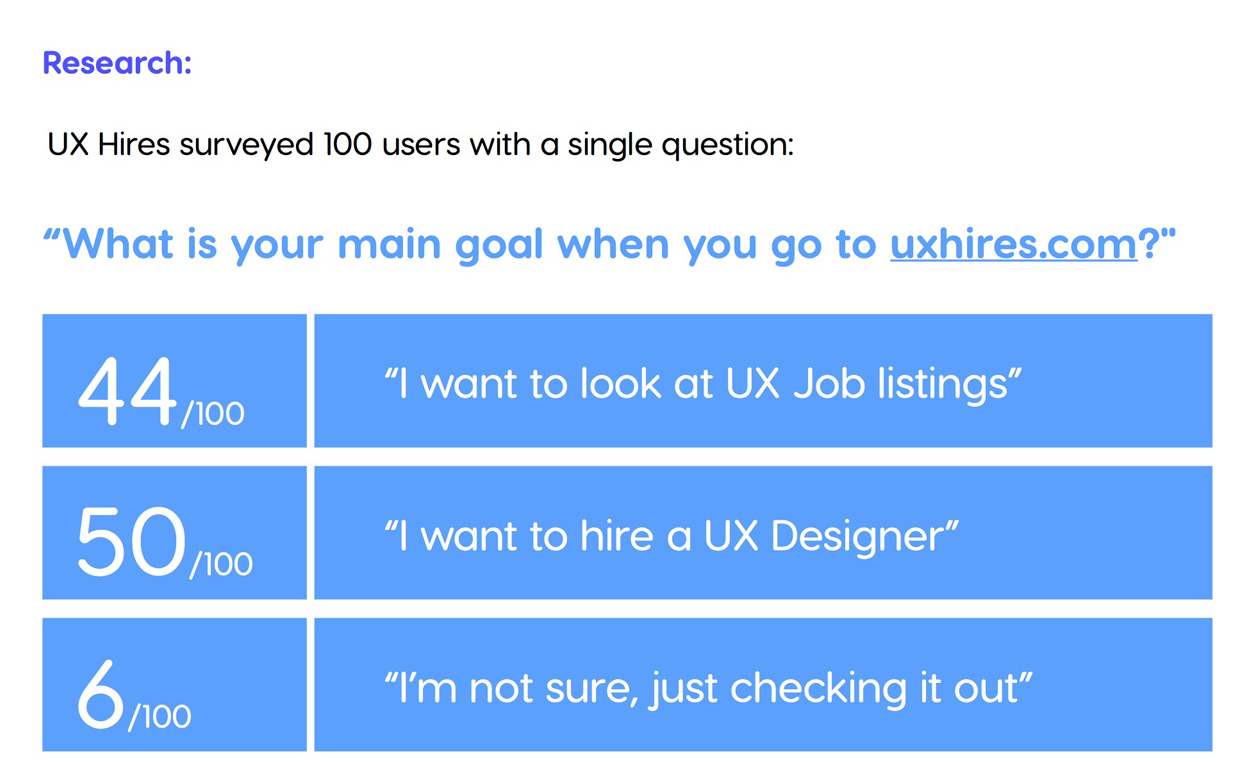
UXHires provides the following results from a survey asking 100 users:
"What is your main goal when you go to uxhires.com?"
- 44/100 say they want to look at UX Job Listings
- 50/100 say they want to hire a UX Designer
- 6/100 say they are not sure and just checking out the site
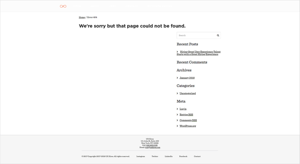
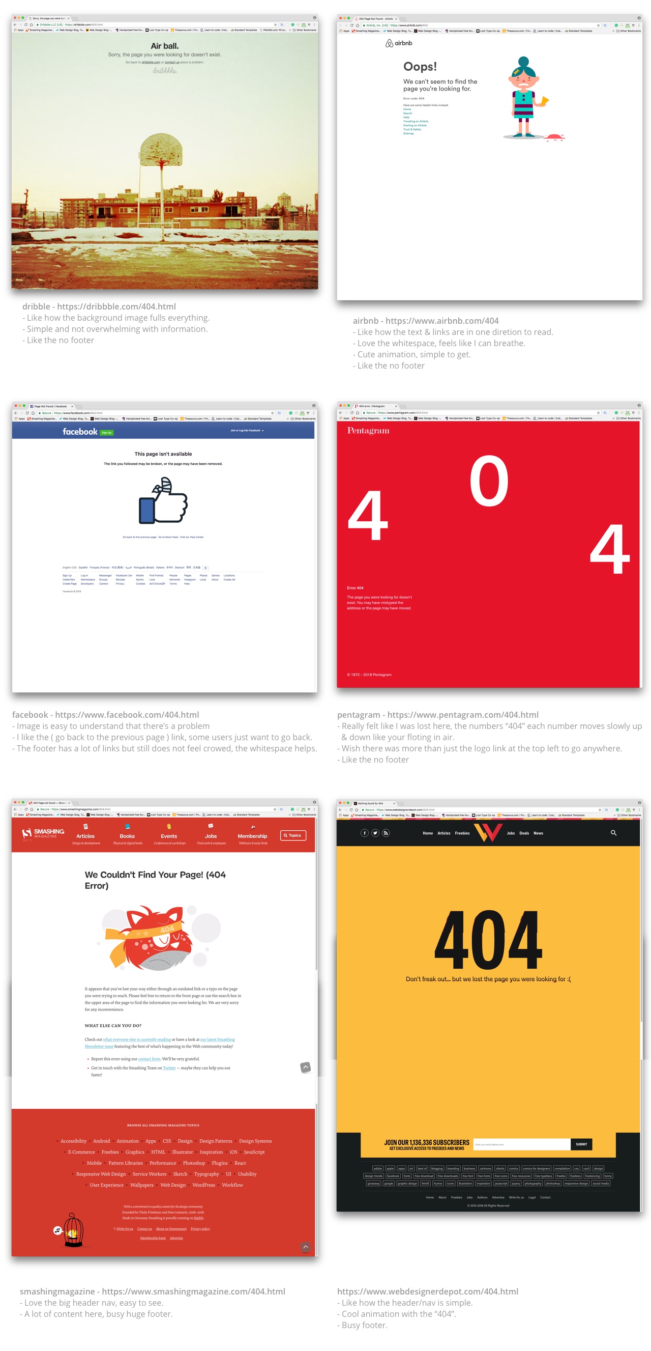
Researched other well-known companies for examples of how they display their 404 error pages.
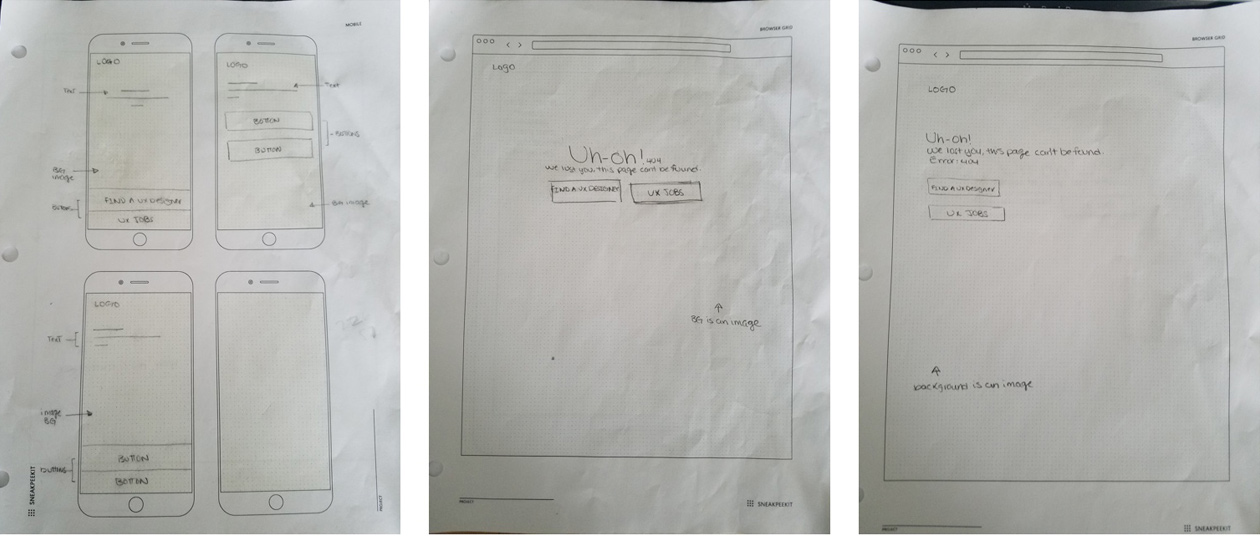
Process
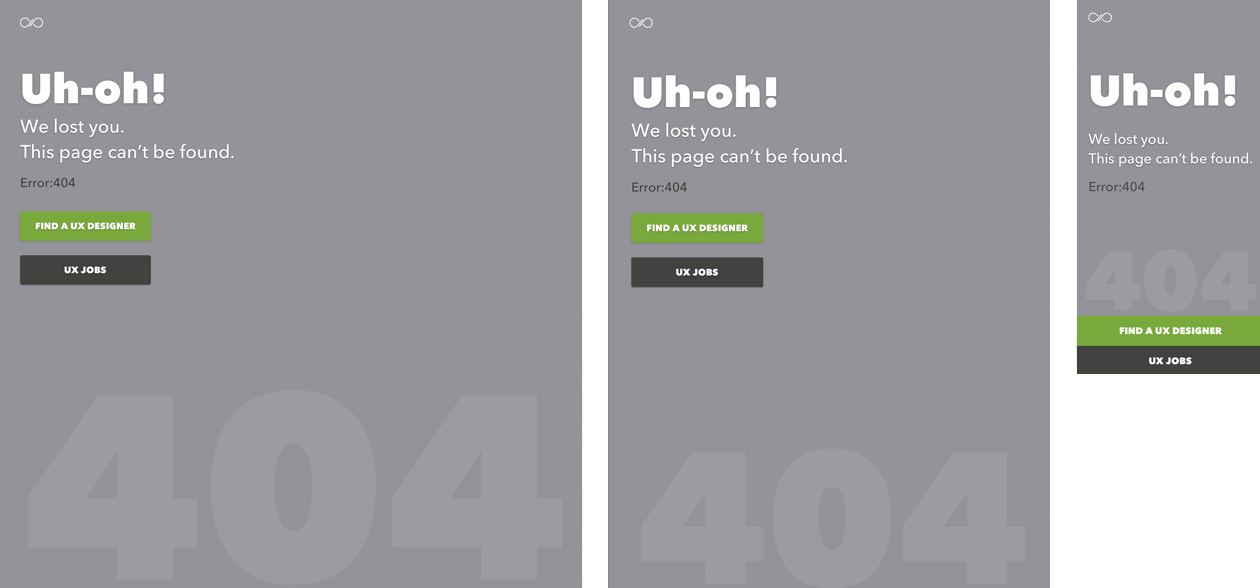
Because of the potential frustration experience a user will have when accessing an incorrect or broken link, I thought of keeping things simple and straight forward. I sketch out low-fidelity wireframes for possible concepts, then high-fidelity wireframes to continue to show the process.
Feedback
After submitting my deliverables to the UX challenge, I received a positive amount of feedback to continue to keep moving forward.
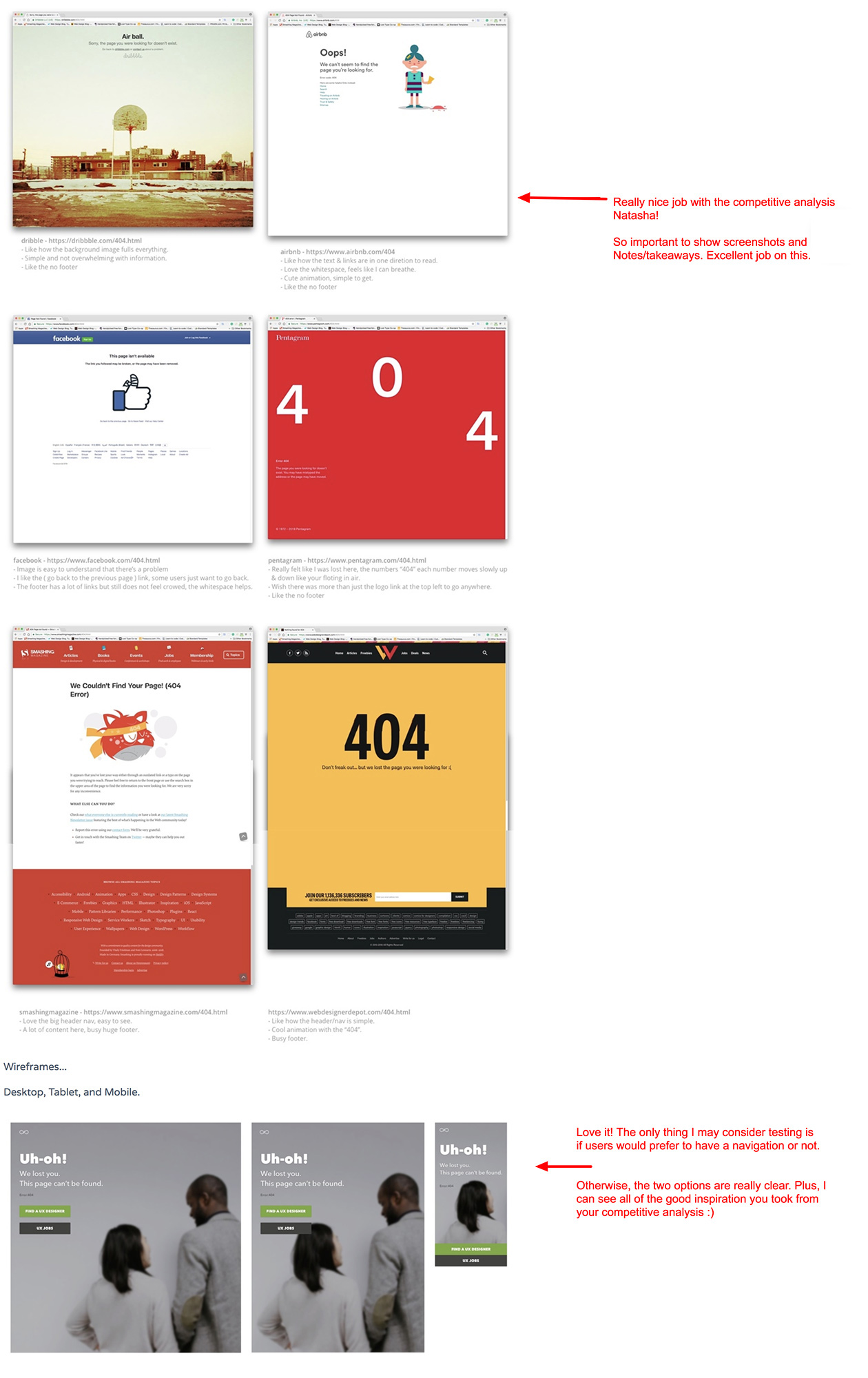
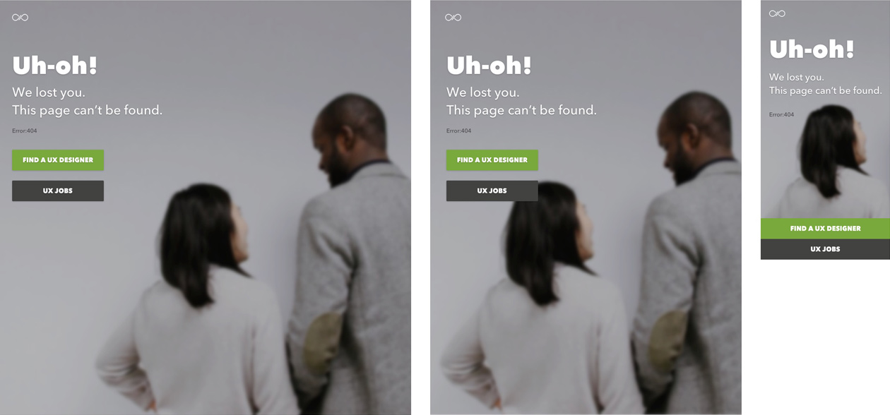
Changes & Updates
Based on the feedback, I considered adding navigation to my concept designs. But I researched uxhire.com (mobile & desktop) again for that specific request and came to find out they don't have navigation for mobile-only, so I kept my current designs. Come to think of it, another potential frustration I saw in my layout was a background image. I removed the background image and only used a background color instead. I visually added the "404" text at the bottom just in case the error message was still too small.